I sometimes while away long but enjoyable hours (I’m embarrassed to say how many) playing with Photoshop, tinkering with photo images or, as in this case, engaging in little experiments.
 This project began as an attempt to replicate the effects achieved by online services that create a cartoon image from a photograph. I consulted online tutorials and borrowed techniques from some. I was ultimately unsuccessful (as were other tutorialists) in producing an image that really looks like a cartoon drawing. (I suspect it takes a little more manual effort and drawing skills than I brought to bear on the project.)
But after some experimentation, I was able to produce images that I think are kind of cool, using fairly simple Photoshop techniques. The results remind me a little of etched and hand-tinted 18th century caricatures.
Here are the Photoshop commands I used (the name/name format refers to menu, followed by menu item or submenu and menu item):
· Crop tool
· Image Adjustments/Brightness-Contrast
· Filters/Artistic/Poster Edges
· Image/Adjustments/Posterize
· Image/Adjustments/Curves
· Selection tools (Magic Wand, Lasso, Rectangle)
· Edit/Cut
· Edit/Transform/Warp
· Filters/Distort/Spherize
· Filters/Distort/Pinch
· Filters/Liquify
· Layer/New Layer/Solid fill color
· Layer/Arrange/Send to back
Most are fairly simple and self-explanatory, but if you’re not familiar with them, you might want to consult the Photoshop Help files first.
Okay, here we go.
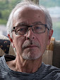
 1. Select an image in which the main subject is well and evenly lit against an uncluttered background. My source images (an example is posted here) were not optimal but worked okay. I shot outdoors in daylight using flash with a bouncer. This inevitably created some shadows. Because the background is so far away, it’s virtually unlit, so comes out almost black. This made it easy to select later.
2. Crop the image to isolate the main subject. The simpler the composition the better.
3. The process seems to work best on bright images with minimal contrast, so use the Image/Adjustments/Brightness-Contrast to turn brightness way up – don’t worry too much about burn outs – and contrast way down.
4. Apply the Filters/Artistic/Poster Edges filter. This is what creates the hand-tinted etching look. You can play with settings, but I had best luck with Edge Thickness set to 0, Edge Intensity to 1 and Posterization to 2.
5. Use Image/Adjustments/Posterize to further reduce the number of tones. Setting levels between 12 and 16 seemed to work best for me, but it will depend on the original image – and the effect you want.
6. Use Image/Adjustments/Curves to further blacken blacks and saturate colours. I found the Moderate Contrast preset worked well for my images.
7. Select the background using the Magic Wand tool. You may have to experiment with the Toleranace setting (in the status bar at top of screen) to get it to select mostly background. And you will probably have to use other selection tools – Lasso, Rectangle – to fine tune the selection. (Use the Add mode to select parts of the background that weren’t selected initially, and Subtract mode to unselect parts of the main subject that were inadvertently selected.)
8. I would normally use Selection/Modify/Feather, but for this, I wanted a hard-edged cartoon-like look. If you do use Feather, keep the number of pixels low. Otherwise edges will look fuzzy. (The optimal number will depend on the size of the image and selection.)
9. Use Edit/Cut to remove the pixels from the background. You should now have a transparent background (grey checker-board pattern) around your main subject.
10. The next step, distorting the subject to make it a little more like a caricature, is the creative part. Experiment with Edit/Transform/Warp as well as Filters/Distort/Spherize and Filters/Distort/Pinch. I found these enough, but you could also try Filters/Liquify. I didn’t like the way Liquify smears pixels to create its distortions, which to my eyes destroyed the integrity of the image. However, if you use it carefully, it can produce amusing effects.
11. Now you want to add a background. I liked the look of just a bright, electric-coloured solid fill, but you could try patterns or even scanned cartoon images. To create a solid fill background as I did, use Layer/New Layer/Solid fill color. The dialog lets you pick a colour, but you can always go back and experiment with different colours later.
12. The new fill layer will initially cover the image. You need to use the Layer/Arrange/Send to Back command (with the new fill layer selected). Now it will be behind the Background layer and will show through the transparent area around the main subject.
That’s it.